PITCH COMPETITION
UX DESIGN
2024
Compass
An app that helps students beat burnout by finding their community on campus
DESIGN PROCESS

TIMELINE
1 WEEK, MARCH 2024
TEAM
2 designers with Travis Huynh
ROLE
Co-Product Designer & UX Research
TOOLS
Figma, FigJam
PROJECT SUMMARY
I signed up for a design competition to get out of my comfort zone
Compass was conceptualized as a part of a pitch competition, my co-designer and I developed an MVP to address the growing mental health issues in post-secondary students in Canada. We found the lack of accessible mental health resources and community engagement are key contributors to student stress. Our pitch aimed to provide a tech-driven solution to connect, simplify, and support personal growth.
We had a week to complete this and make it presentation ready.

The duo in question: Bre and Travis!
THE PROBLEM
New city, new me... now how do I make friends?
I couldn’t navigate university on my own. I was burning out from academic stress and needed an escape. My main friends were from my hometown or from being on the cheerleading team. So much that my friends and I created a club: University of Waterloo Students Association (FSA). But what I realized:
University life offers countless opportunities for personal and intellectual growth, but it also comes with its fair share of challenges. Academic success comes with the price of a student's quality of life, also known as college burnout.

Me when I actively try to close the burnout gap
DISCOVERY
Before touching anything design, we looked into the psychology and motivations behind college burnout
The University of Virginia Department of Economics researched student burn out. They found that the leading cause had nothing to do with academics, rather factors that fall into 3 leading psychological causes.
01 - Isolation
Spending too much time alone between class time and course work
02 - Pressure & Expectations
Deadline after deadline having to complete tasks and receive high rewards to move forward
03 - Fitting In
Insecurities in finding friends on campus worried about fitting in with the crowd
UX RESEARCH
Currently 20% of Canadian students have been able to receive mental health services from their university.
A PESTLE analysis helped us to discover a product opportunity with social, economic, and technological assumptions.

UX RESEARCH
We wanted to hear first-hand experiences
By conducting primary research to intuitively cater the final product to their needs. We decided to conduct 4 interviews and surveys (12 responses out of 20) in order to scope out user interest. The main reasons for college burnout included to: isolation, fitting in, and internal / external pressure.

UX RESEARCH
After finding out the basic requirements of the user, the key features were identified and ideated


FINAL DESIGNS
Highlighted features
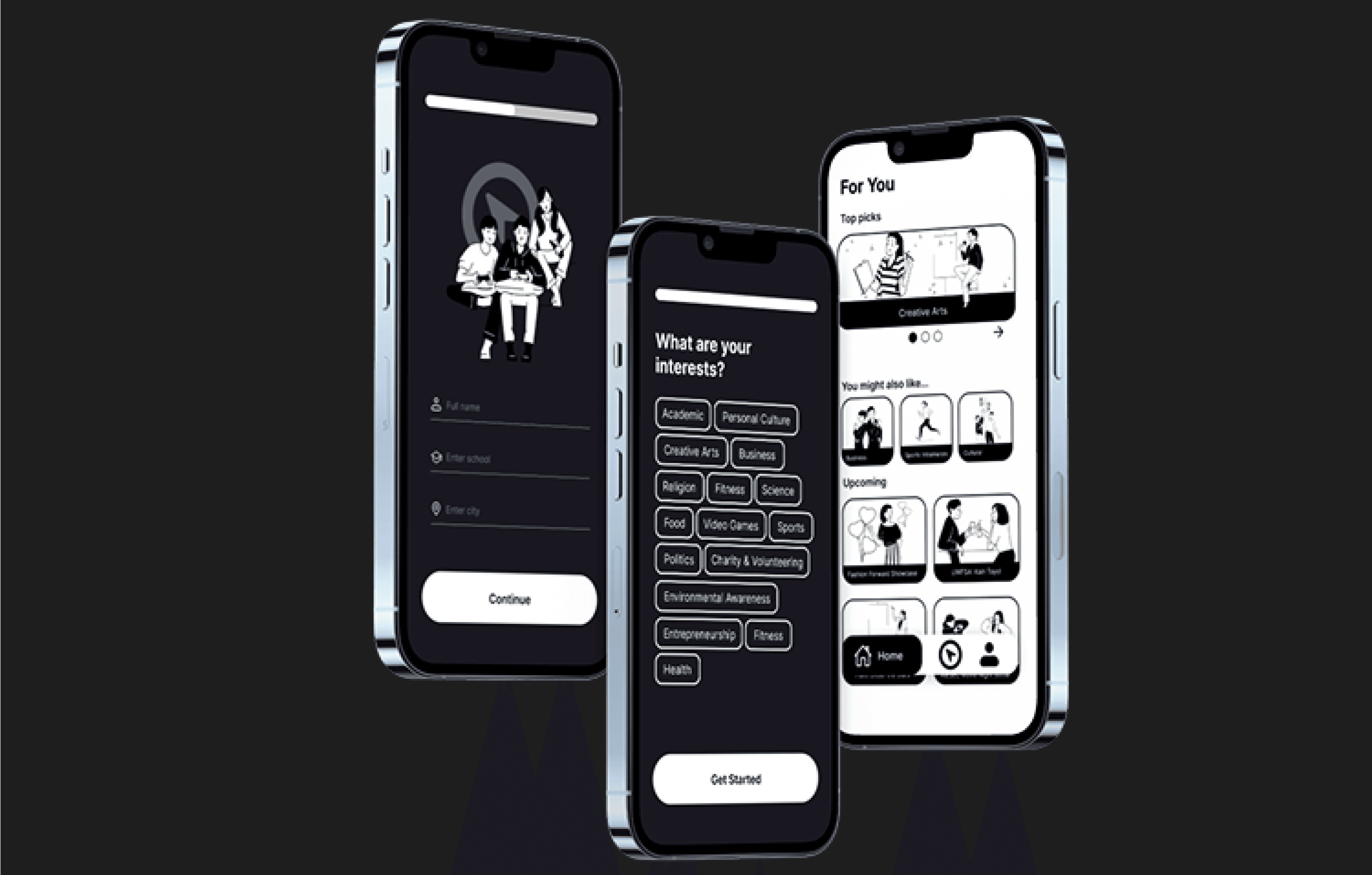
Making clubs accessible for all students
The "compass" is the main function of the app to allow users to navigate clubs at their school. A simple interface makes it easy for students to start exploring clubs.

Upcoming events & notifications
Users can follow clubs and get notified about updates based on their interests.

Initial survey & personalization
A short onboarding survey narrows clubs down to each student's interests, so they aren't overwhelmed by options.
KEY TAKEAWAYS
What did I learn and what would I change?

A lot can get done in a short amount of time
This project gave us a look behind the scenes of how business models are produced and made with a start-up idea. One week was the true benchmark on delivering the final product while mass sending surveys and conducting last minute interviews.
The first iteration isn't the last
With more time, I'd run usability tests with students, then compare versions to see what drives campus involvement. I want to see different ways we can increase campus involvement. Bigger picture: add flexibility for different types of students that don't see community as "help" for mental health.
thanks for stopping by (˶>⩊<˶)
designed on figma, built in framer
breanna levy © 2026
Resume