
CASE COMPETITION
UX DESIGN
FULL CASE STUDY
2026
CIBC Launchpad
Helping newcomers feel like more than just their next transaction.
DESIGN PROCESS
TIMELINE
May - August 2026
TEAM
5 Interns, including me
ROLE
Solution Designer
TOOLS
Figma, CIBC Design System
PROJECT SUMMARY
I owned the solution design for a team case study focusing on the newcomer segment.
FLEX was a 4-month case competition inside CIBC: teams of interns were challenged to design a solution that could move revenue within one of the bank's digital channels, then present it to senior executives.
I worked alongside a team of 5 interns across CIBC. They covered customer research, competitor analysis, and cost-benefit modelling; I translated that research into an actual product experience, Launchpad, and presented the solution to CIBC executives, with mentor support guiding the work throughout.
The presentation went well enough that we were invited back to present again, this time to the SVP of Client Segmentation and Franchising, for an open discussion on integrating Launchpad research into CIBC's actual newcomer strategies.


THE SOLUTION
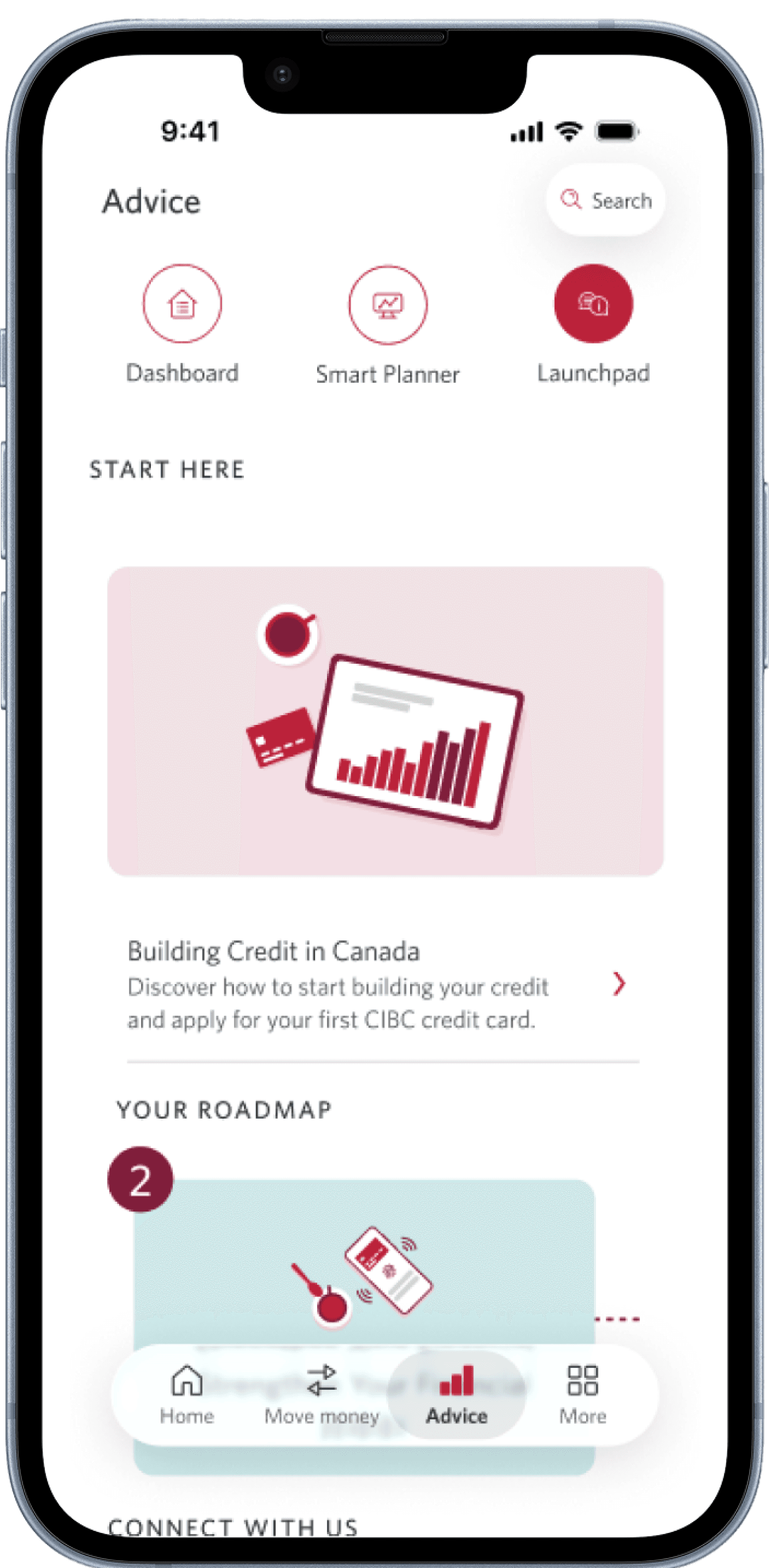
Introducing a new way to learn about the Canadian financial system
Launchpad is a personalized learning hub inside the CIBC mobile app that guides newcomers through the Canadian financial system in bite-sized modules.
UNDERSTANDING THE PROBLEM
Our current experience is not meeting newcomer client needs
CIBC makes it easy for newcomers to open their first account — but everything after that moment falls flat. Once they're clients, the resources meant to teach them how to actually bank in Canada are scattered, generic, and hard to find. CIBC engages newcomers well enough to win them, but not well enough to grow with them.
This gap meant clients were: holding only their starter product, disengaging from the app entirely once onboarding ended, and relying on outside sources or guidance CIBC should be providing.
Meanwhile, the data to close that gap already existed — newcomer onboarding patterns, products held per client, cold leads sitting unconverted — just never connected to anything. This project started from a simple shift in perspective: stop treating newcomers as an acquisition target, and start building an actual relationship with them.
THE MARKET OPPORTUNITY
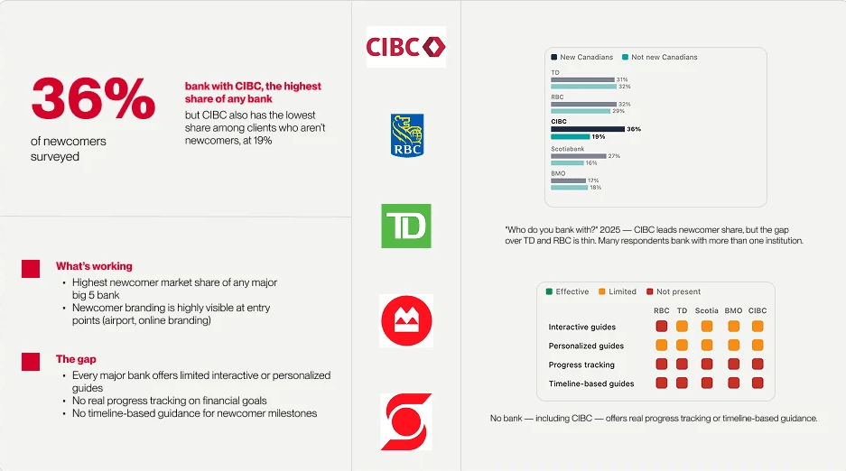
CIBC already leads with newcomers — but only by a slim margin
A 2025 survey on who newcomers bank with, plus a comparison across the 5 largest banks, told us where the real opportunity was hiding.
PERSONA
Meet Mei, she’s still finding her footing in Canada
28, an international MBA graduate from China who moved to Canada permanently, working as a Business Analyst while living with two roommates in downtown Toronto. She chose CIBC the moment she landed — its branding was everywhere at Pearson Airport, and she expected that same strong first impression to carry through.
Her expectations of CIBC are high — because the newcomer experience is what earned her trust in the first place. Launchpad either meets that bar, or she goes back to social media for answers.

Business Analyst
Downtown Toronto
$68k / year
Origin: Wuhan, China
Goals
Build credit history
Manage expenses
Create financial stability
Eventually buy a home
Frustrations
High cost of living
Navigating a new banking system
No clear / trustworthy information
IDEATION
I empathized with Mei using user journey mapping
To keep our user goal as our north star during this project, I tracked the steps, thoughts, and emotions Mei experiences while trying to accomplish a goal with our product.

Digitized from my original handwritten journey map with AI assistance.
IDEATION
I started with quick sketches and paper prototypes
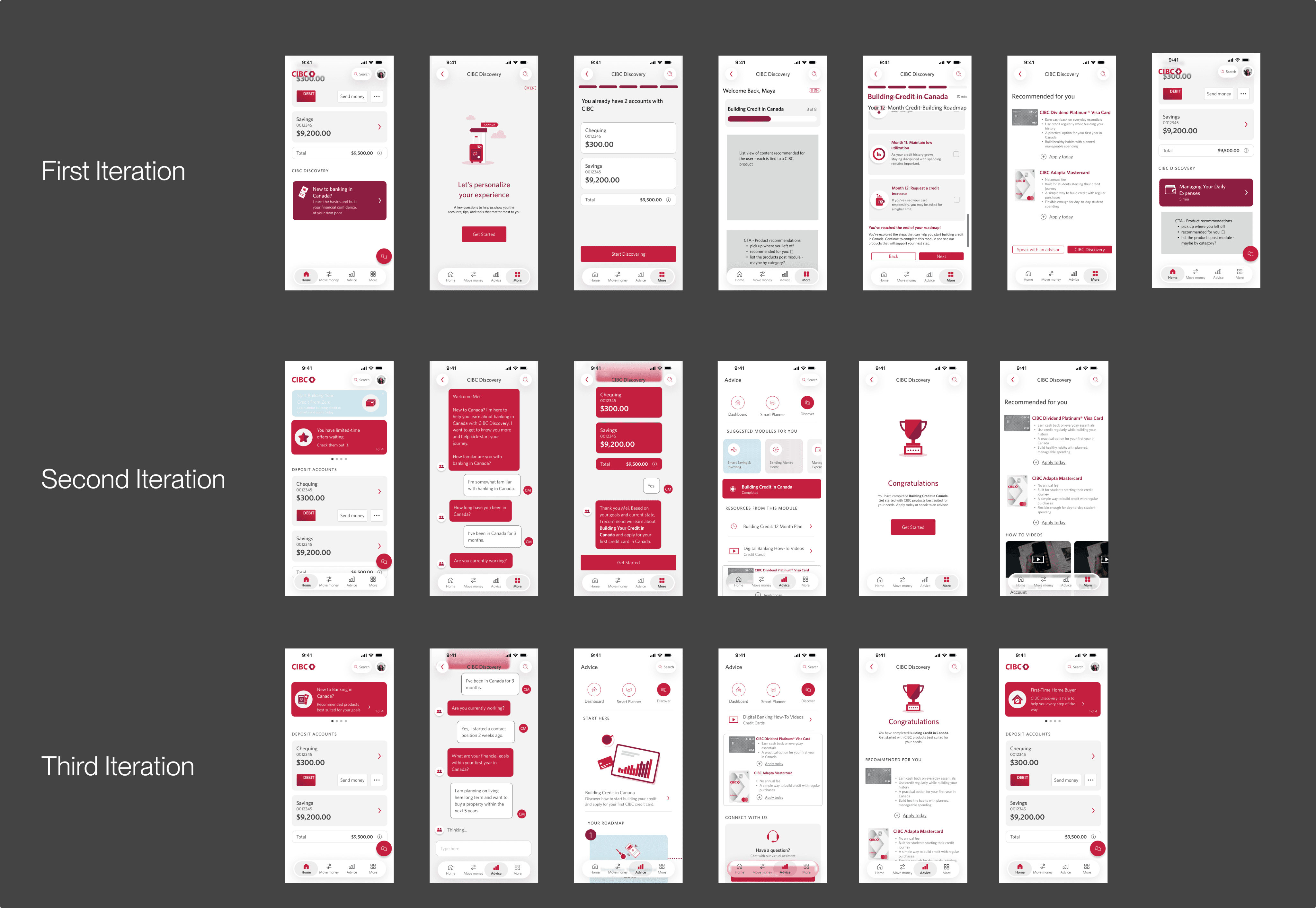
Over four months, I worked one-on-one with mentors to refine the concept through sketches, which led to 3 digital iterations.

IDEATION
I then refined each iteration based on feedback
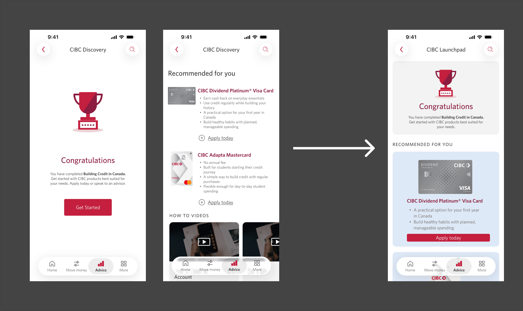
Version 1 separated the end module screen from the recommended products. Mentors pointed out we should consolidate these two screens into one to reduce cognitive load on our users. So I changed it to fit within one thumb scroll reducing user touch points.

Our first onboarding was a simple Q&A. After mentors shared that CIBC was exploring chatbot-style interactions, I tested different chat formats to make onboarding feel more personal and trustworthy.

Rather than build something new, we worked within what CIBC already had. Launchpad lives on the Advice page, which already sees 17.27M interactions a year across 8.47M personal and business banking (PBB) clients, and uses Braze banners to reach users in-app without new development.

Our first version showed everything at once: suggested modules, resources, and a separate credit card promo. Mentors pointed out that for someone new to Canada, more choice meant more hesitation. Our new home screen gives Mei one clear place to start, a roadmap showing what comes next, and a product offer that feels like the natural next step in her learning rather than an ad."
IDEATION
After feedback, I moved on to wireframes
Building on the sketches, I created digital wireframes using the CIBC design system to refine the core user flow and test different layouts with our mentors. This stage helped us visualize how financial education supporting the newcomer journey with increasing revenue within mobile banking can work together. This gave us a solid foundation to move into our high-fidelity designs.
FINAL DESIGNS
Highlighted features

Low-friction personalization
Mei is still learning how banking works in Canada, so a long setup would lose her. A few quick questions about her goals, like building credit, let Launchpad show only what's relevant to her from day one.
Guided financial education
Mei doesn't know which sources to trust, so she ends up on social media. Short modules built from CIBC's existing content give her reliable answers she can finish in a few minutes and pick up again later.
Strategic in-app placement
Once onboarding ends, newcomers like Mei stop opening the app. Placing Launchpad in the existing Advice tab gives her a consistent place to return to, keeping her learning with CIBC instead of elsewhere.
KEY TAKEAWAYS
Learning and Impact
Designing for trust taught me to look past the interface.
Mei's biggest blocker wasn't a confusing screen; it was not believing CIBC's content was for her. That reframed how I think about "usability" going forward. The real opportunity wasn't a feature no one had thought of, it was a gap every competitor, including CIBC, had already left open.
Tying every decision back to data or persona research.
Presenting to executives meant every design choice needed a number sitting right next to it — usability alone wasn't the pitch, ROI was. This meant every component was there for a strategic reason. In some cases we needed to reiterate non-traditional features on the current experience to match our data sets.
My first time designing for the client, not the employee.
Most of my prior work was internal-facing where adoption came for free because it was their job. Designing for someone like Mei meant I couldn't lean on that assumption: I had to design for trust before I could even get to usability, earning her attention with zero onboarding to the idea of the product itself.
thanks for stopping by (˶>⩊<˶)
designed on figma, built in framer
breanna levy © 2026
Resume